KSDETASN
Tools and Tech to support special education in Kansas.
Background
Kansas Technical Assistance System Network (TASN) is a network of organizations that provide training and resources to special educators. We built them a robust platform to showcase a dozen of organizations that deliver specialized research and training for topics in special ed. The website was designed back in 2014 and while we've added a TON of feaures and tools - it hasn't had a redesign since.
Here's the old look:
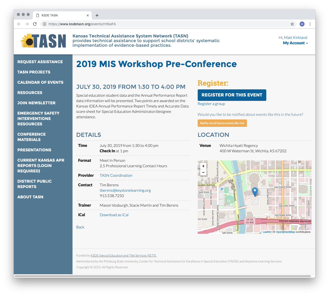
It's 2022! Let's do better.
A redesign was needed in order to match the friendly, resourceful, and professional nature of TASN, and to improve the user experience.
The main goal of the website redesign is to refresh the look and showcase TASN's services and resources more effectively. We laid out the following objectives:
- Create a modern, responsive website design that accurately reflects TASN's mission and values
- Make the website more user-friendly, with clear navigation and easy access to information
- Highlight TASN's events and resources, including training courses, workshops, and online resources
A new design system
We started the process by freshening up the platform’s typography and colors. This is our designer’s favorite part as they get to examine the different letterforms and color combinations that give a better reflection of the brand. The pairing of geometric Poppins and grotesque Work Sans offers a clean, simple look with a touch of personality. Both fonts are designed for legibility which is essential as users browse the vast collection of data.
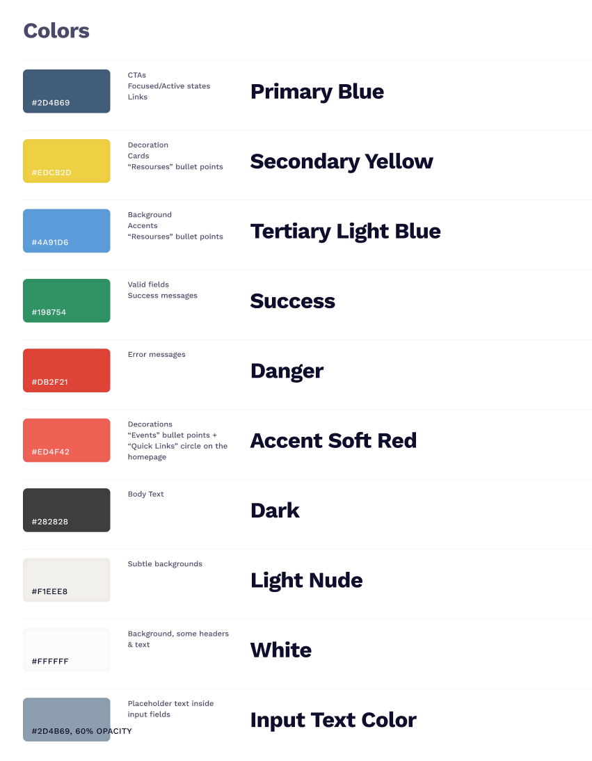
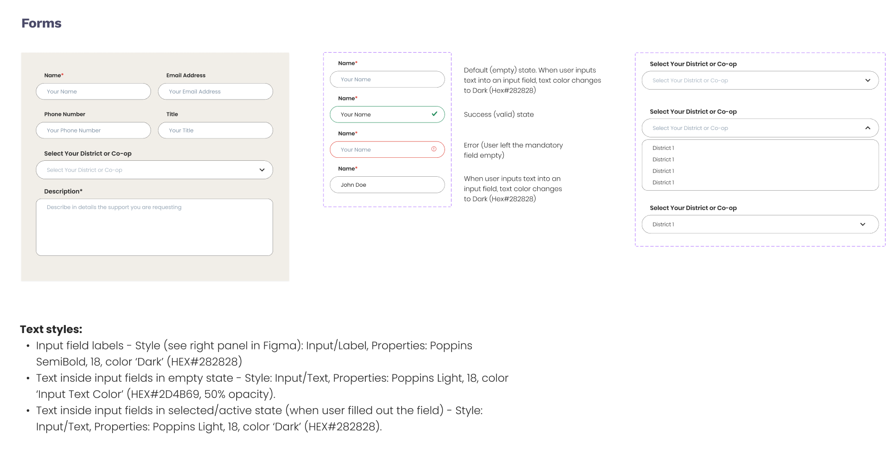
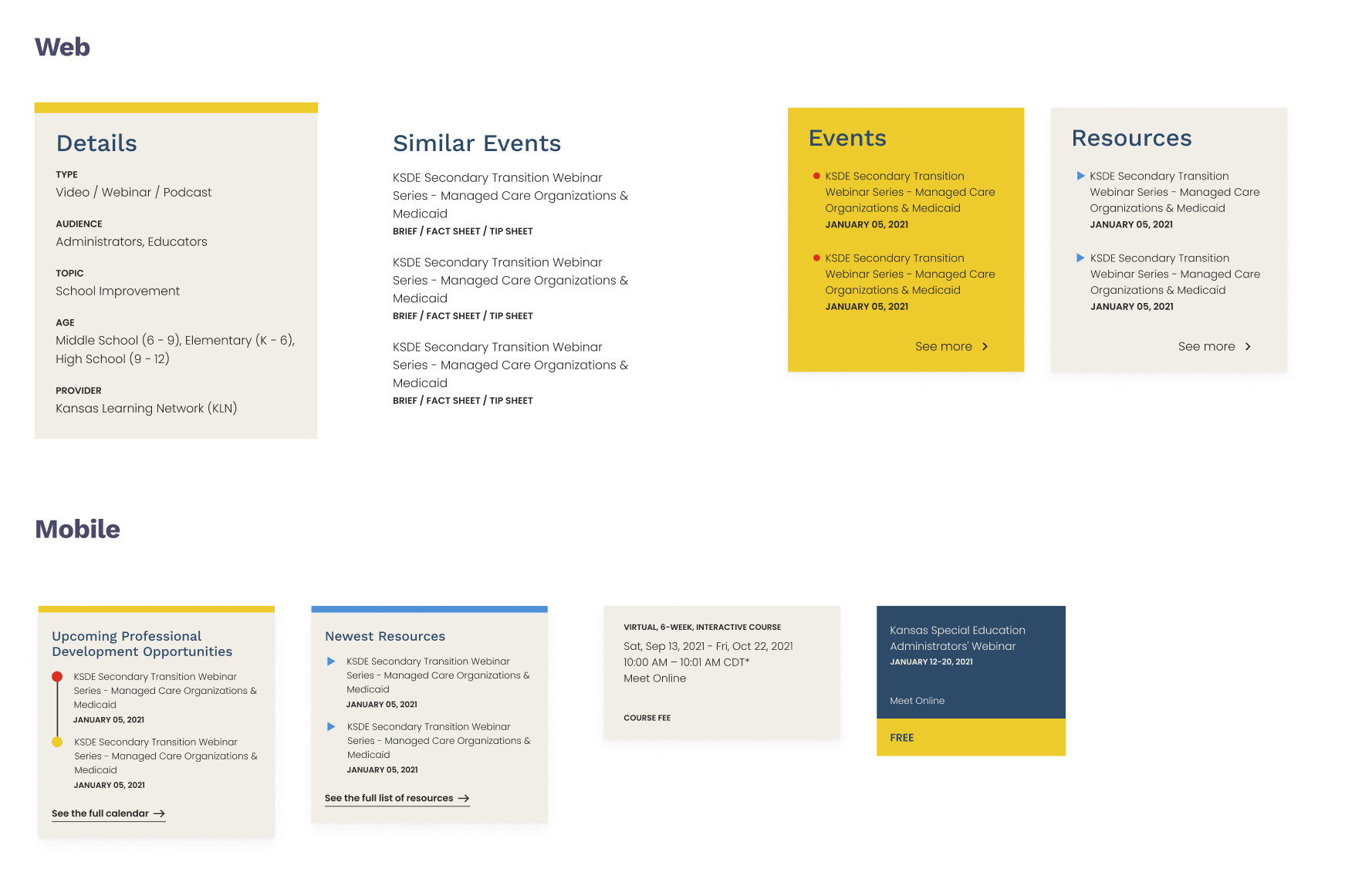
We added more colors to the existing blue and yellow to create a flexible palette that reflects the resourceful nature of TASN. Patterns of geometric shapes are used as decorations throughout the site to tie back to the educational and technical elements. Components such as buttons and form fields have rounded corners to evoke a friendly feeling.

Some rearrangements
The old layout had several challenges that made it difficult for educators to access the information and resources they needed such as cluttered pages and a lack of visual hierarchy.
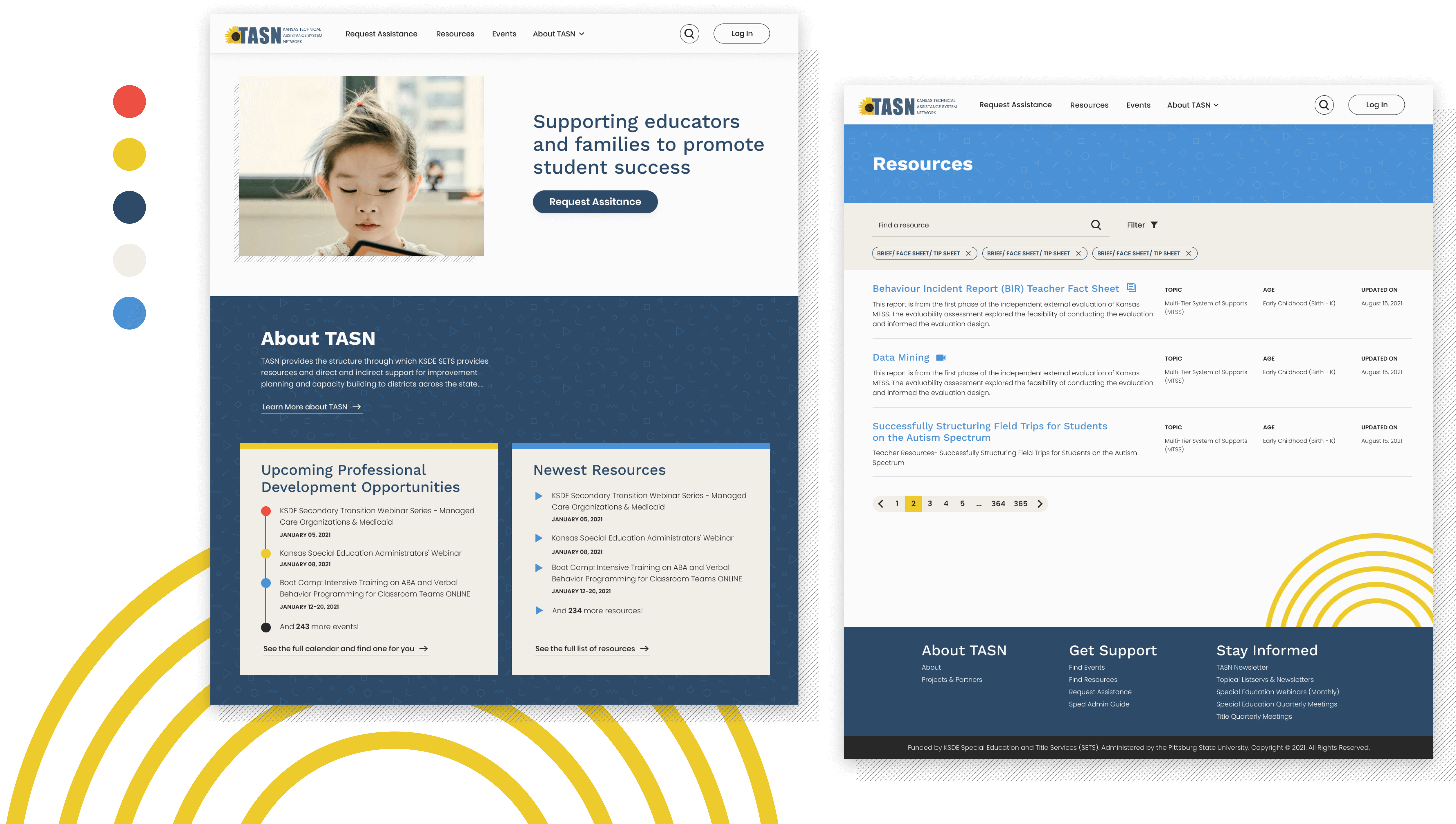
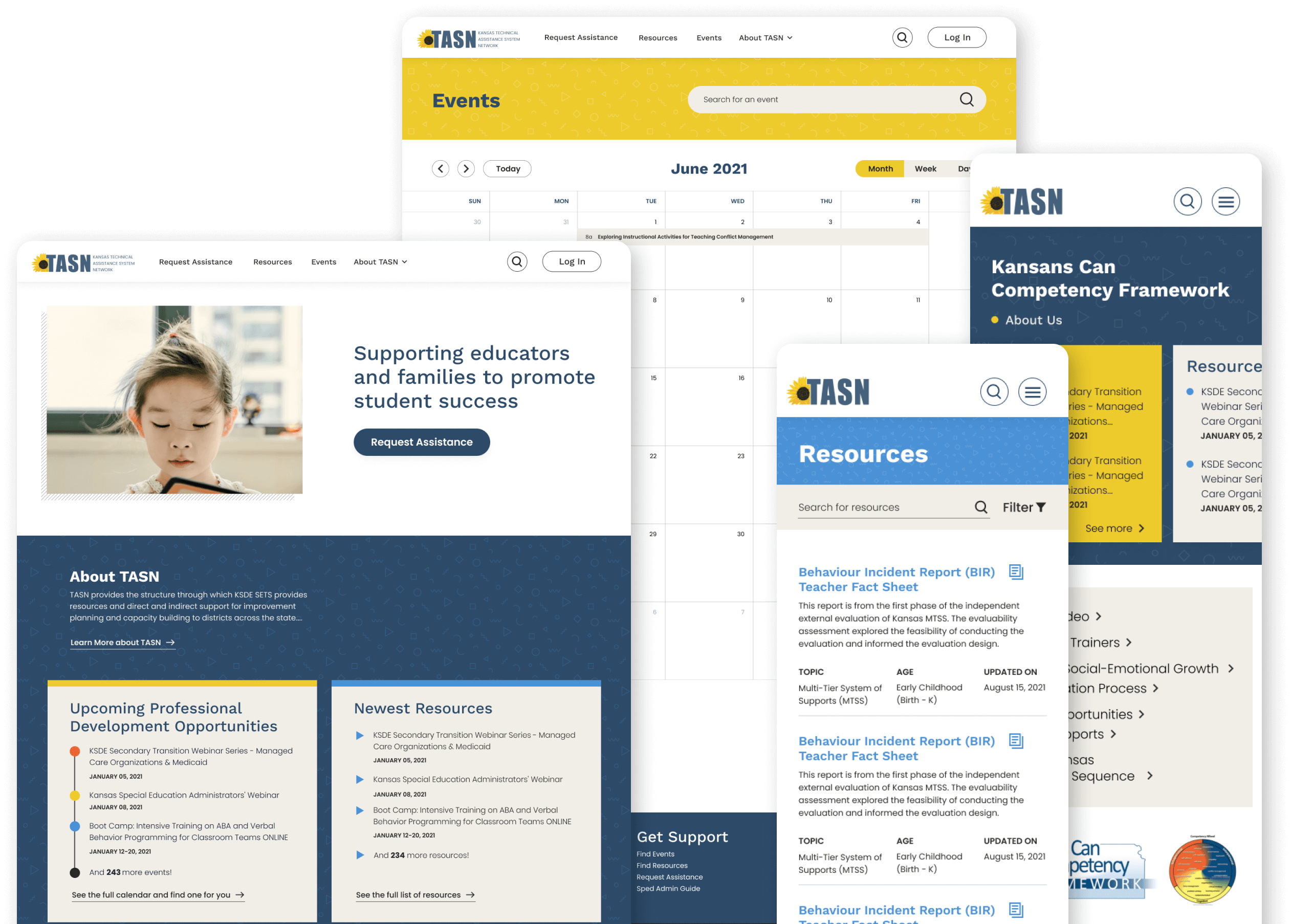
The new design features more white space for breathing, easy-to-use navigation and clear calls to action. The homepage features more relevant content and resources in an organized and visually appealing manner. We spotlighted some upcoming events and resources on the individual organization’s page. We added icon indications for each resource type.
Putting it altogether, it builds a pretty great overview.
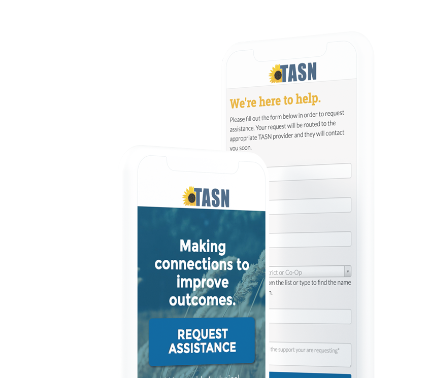
And of course, mobile!
A huge segment of TASN’s users are on their mobile devices - so of course we paid special attention to making sure the site works great on phones, tablets, and whatever else is handy.


